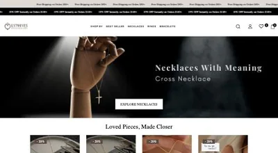
Colour is one of the first things a visitor notices, often before they read anything. It sets the mood of the brand, guides the eye towards what matters and makes a store easier or harder to use. You'll find many claims about what particular colours "mean"; in practice, a few clear principles matter much more than colour theory.
What colour actually does on a store
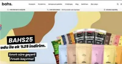
- Sets the tone: soft, muted tones feel calm and premium; saturated colours feel energetic and playful.
- Creates hierarchy: the eye goes to what stands out, so colour tells visitors where to look.
- Signals actions: a consistent button colour teaches visitors what is clickable.
- Supports recognition: consistent brand colours across the store, packaging, ads and social make you easier to remember.
Build a simple palette
| Role | Where it's used | Tip |
|---|---|---|
| Neutrals | Backgrounds, text, borders | Most of the page. Off-white and dark grey are often easier on the eye than pure white and black. |
| Brand colour | Logo, headings, key sections | Reflects your brand personality |
| Accent colour | Primary buttons and key links | Use it sparingly so it keeps standing out |
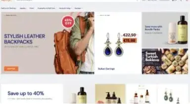
| Feedback colours | Sale badges, errors, success messages | Keep them consistent across the store |
Let products be the colour
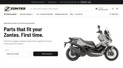
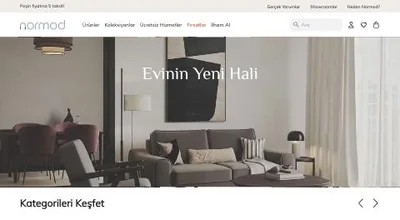
If your products are colourful (clothing, homeware, toys), a restrained, neutral store design lets the photos stand out. If your products are plain, the brand colours can do more work. Consistent photography with neutral backgrounds often improves a store more than any palette change.
Contrast matters more than hue
Low-contrast text, such as light grey on white, is a common problem on stylish stores. It's hard to read on phones and in sunlight, and it fails accessibility guidelines. Aim for the WCAG contrast ratio of at least 4.5:1 for normal text. Free contrast checkers make this easy to test.
- Don't rely on colour alone to show information. For example, mark sold-out sizes with a line or label, not just grey text.
- Check buttons in every state: normal, hover, disabled.
- Check how sale prices and badges look to people with colour vision deficiency.
Setting colours in Shopify
In the theme editor, open Theme settings → Colours. Most current themes use colour schemes: you define a few combinations of background, text and button colours and apply them section by section. Define the schemes once and reuse them, and the store stays consistent. See our theme customisation guide.
Test changes properly
If you change a key colour, such as the main button, compare conversion over a meaningful period, or run an A/B test if you have enough traffic. Small cosmetic changes rarely move results on their own; clarity and contrast usually do.
If you'd like a design review alongside conversion analysis, see our conversion optimisation and theme development services.
Frequently asked questions
What is the best colour for an add-to-cart button?
There is no single best colour. What works is a colour that stands out from the rest of the page and is used consistently for the main action. A button that blends in will be missed, whatever its colour.
How many colours should a store use?
Usually a neutral base for backgrounds and text, one or two brand colours, and one accent colour for actions. More than that starts to feel busy.
Do colour meanings differ between countries?
Some do, for example colours associated with mourning or celebration. If you sell in several markets, check that your palette and campaign colours don't carry unintended meanings.

Author
Uğur KeskinFounder @ShopiuzmanFounder of Shopiuzman. He builds, migrates and grows Shopify stores for brands in Türkiye, Europe and the US, and leads the development of our apps on the Shopify App Store.